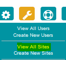
To view the graph, navigate to the relevant site (you can do this by clicking on the 'spanner' icon, selecting view all sites from the drop-down and searching for the site by name or postcode).

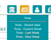
Using the 'newspaper' icon in the top banner, navigate to the rota page.

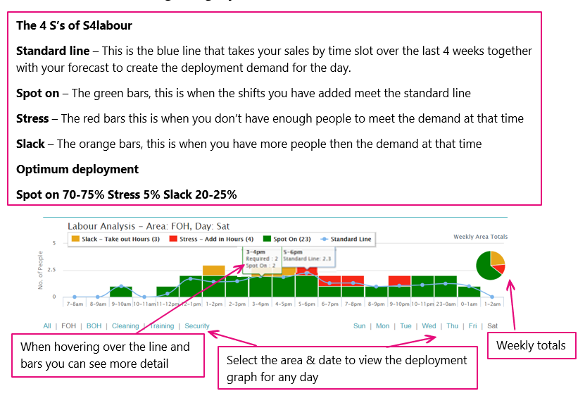
Regardless of how far down you scroll the graph remains at the top of the rota page for convenience. The graph displays the number of hours and an optimum number of employees needed at any given time to best achieve sales targets and deliver the best quality of service.

Understanding the graph

Furthermore, the standard line represents your suggested deployment level. This is based on rolling sales information from your tills as recorded in the last 4 weeks.
It is important to note that the graph can help you visualise staffing levels area by area. Two sites could have a similar blend of spot-on, stress, and slack when viewing all areas, but this could hide completely different trends in specific areas (e.g. Kitchen and FOH).

Comments
0 comments
Article is closed for comments.